DVD inlay
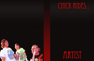
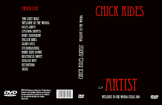
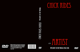
For my media a2 course work, I have had to design a promotional package, involved in this is a DVD digital design and also an advertisement for the DVD that I have created. Above is a step by step progress of my design on photoshop of my DVD cover.I have also created an inlay to go on the inside of my digi pack that matches the outside, as it is the same in colouring and font type matches the outside of the digital package. I have also uploaded a photo of the band onto the inside of the dvd inlay, this shows some members of the band.
In order to get this final piece, i had to consider many things including, genre, audience, house style and theme. Firstly I considered the genre and house style; what would bands like Chick Rides would include in there advertisments and designs? To do this, I had to research bands in order to receive a good idea of what is a suitable advertisement process for a band like Chick Rides, so i looked at similar artists.
Paramore

Fall Out Boy
You me at Six
Bullet for My Valentine
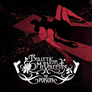
other examples include 30 seconds to mars and green day.
My first idea was to take a band photo and use that as my front cover, with certain edits on the cover for example Fall Out boys cover when you have the band but with logos on there heads, or like Paramores' in which connotes the lead singer Hayley Williams being the only one in color, I chose these ideas as these bands are successfull and the designs obviously appear to the bands audience. This initial idea fell through, because although I did have some decent photographs of the band members, I didn't have the one I wanted and the band had gone away making it hard to get another photo so I went back to the drawing board, and looked at other examples, and then i noticed that actually, most of the genre when noticing front covers of CD's and DVD's, a lot of them were graphic based, so i worked with this taking inspiration from Green Day: Bullet from a Bible and also Rage Against the macheine. Both of these have out lines of the main band members in some sort of stance lifting one arm in the air, rage against the machiene is similar only he is stood as though he is making some kind of political movement.

The DVD cover that I have constructed is similar to this, as central we have the band member blacked out holding up a guitar as if he is on stage, I have also placed a glow around him to present an illusion of him standing in front of an audience, the glow could be from cameras and flashes ect. It also gives establishes that they are a band, with a strong following, who play live. This is exactly the kind of thing that Chick Rides Artist would want to have in order to represent them selves.
When considering how I was going to design the DVD digital pack itself, I also had to consider the genre and who was going to buy it and be attracted to it. Greenday and Rage are both very successful rock bands, therefore taking inspiration from these two bands is liable, as you can see we have the black fill of the lead singer supposedly on the stage, with a glow outlining him and this accentuates the lights and crowd as if he is on a stage and has just finished performing, this is recognisable as live performance is one of the main thing that justifies a rock band. I also took inspiration from music magazines and other DVD/CD digital packs with the colouring, for example Paramore use Red and Black to present themselves, and Fall Out Boy for their latest CD cover have used Black and white. I have also deconstructed a Guns and Roses performance DVD and I like them, have used similar colours, and I have also set out the back of it in a similar way placing the tracks in a long list down the central back of the cover.
I have followed all the criteria that is needed to enable my design to be used, for example, relevant DVD logos, the copyright issue and a barcode in which should be available to see on traditional DVD covers.
When creating my promotional package I also had to include a design for a magazine advertisment.
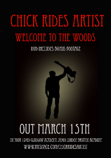
Above is the constructed design for the magazine advert. I again had to consider the same generic conventions and themes when creating it as it is the material in which will initially sell the DVD digital pack itself. Before i created the advertisement I again had to do some research, such as what type of magazine will my advert appear in? How is it going to look? And how will i make it appeal to the reader?
The band that i am researching falls into a metal/screamo/rock category and the most likely magazine that you would find it appearing is KERRANG magazine, a magazine with all the latest news, information, interviews and adverts for famous and upcoming rock bands. In choosing a suitable magazine, i flicked through the pages and analysed adverts wthin in it that are similar to Chick Rides. The main advert that grabbed my eye was Bullet for my Valentines advert for there upcoming single, the whole structure of the advert was similar to my DVD front cover, for example it used the same three colour dynamics: Red, black and white. I there fore thought that this idea wasperfect because it fits in perfectly within the style I am already using for the band, but it is also used by other succesful artists.
As you can see I have included the title of the band in a large font, and also the motif is placed central of the advertisement making it obvious who the band is. I have all the important imformation placed at the bottom of the page, including how to locate them on myspace as myspace is an extremely viable form of web 2 in which rock bands generate alot of their publicity through.
Overall the DVD digital pack and magazine advert are linked by what is shown on them, for example my DVD and advert are linked by font, font size and colour; such as red for large writing, black for the background and white for the smaller font. Both the DVD and magazine have the same logo (man with a guitar on stage) on them and this is done in order to establish the band and logo, and so that people will associate themselves with it. These two products are linked with my music video through mise en scene such as the red black and red theme that follows through the video, and also the logo links with the genre as they are in fact a band and this fact is epitomised on the front of the DVD and advert. This creates a constant representation of the band because in all my products it is made apparent that this is a rock band that is being advertised, through use of musical instruments (DVD and magazine) and through the mise en scene such as the colouring as it is similar because the writing throughout is in red, just like the other products and also the angry format of the video itself.
No comments:
Post a Comment