“Media is communication” Discuss the ways that you have used media language to create meanings in one of your media products
I used certain media language within my As coursework in order to create meaning, this meaning is important in order to fit the correct conventions of genre. For my AS brief I had to create a film opening based around the genre of film noir. Media language is important to think about when putting this together as you need the correct techniques in order to fit the conventions of the film noir genre.
I used the meaning of Mise en scene in my film noir piece. Mise en scene covers everything to do with what you see in the picture such as: setting, props, lighting and costume. The setting of my A2 noir piece was set on a pier. Long shots of the pier are often used in order to gain a sense of place, for example so you can see the quiet sea in the background and the long desolate pier. Mise en scene creates meaning here because noir revolves itself around the times of depression and great suspicion, therefore everything you usually see in noir films can create a sense of secrecy, therefore mise en scene adds to the sense of secrecy here. Mise en scene also uses dark lighting to add to the depressive and suspicious feel.
Mise en scene also connotes a man and a woman wearing extremely dark costume, the man is in a dark suit and jacket and the women is dressed in a long coat and heels. This creates meaning in two different ways, firstly to create a sense of suspicion using Barthes enigma codes as the dark colour scheme for the clothes reinforce this sense of enigma as being dressed in black makes the characters even more mysterious. The shots of the woman’s legs in heels also reinforce as sense of Laura Mulvey’s gaze theory as is promotes a sense of the woman being sexual as all you can see is her legs. The clothing is typical of the 1940’s and 50’s clothing again adding to the meaning as they are wearing what is typical of the time it is taking place.
Sound and music, through media language was also used to create meaning through my work. I used Non-diegetic music within the peace, the music I used fit conventions as it was made in the 1940’s, it had a slow tempo to add to the slow mysterious pace of the film. I slowed down the pace of the music even more to amplify what was going on, on screen. When the passing of the secret note took place I decided to slow the pace of the music down was the key scene within the film opening itself, as it reinforces Barthes enigma codes and this is critical because this is what would keep the viewer interested in watching.
I used media language to create meaning when editing my work. I used simple edits such as Fade out and fade ins to transit between shots, this is because film noir is suppose to be low key and using another type of transition shot wouldn’t be appropriate. Fiske says he sees genre as ‘a means of constructing both the audience and reading subject’ so when I use things such as editing the film with a black and white filter, it creates meaning by adding to audience expectation as this is what they expect from the film noir genre.
Camera work Close-ups and medium shots, long shots of the pier and the lady walking away centre screen into the night creates meaning revolving around storyline and genre. The lady walking into the distance denotes ideas about the male gaze and femme fatale and also enigma codes. This is because the shot centres on this woman walking away with a black fade, and the title ‘lady of the night’ over the top.
Tuesday, 18 May 2010
Wednesday, 10 March 2010
How did you use new media technology in the construction and research, planning and evaluation stages
 I have used Blogspot in order to record the progress of the promotional package. Blogspots technology has been useful to use as it is a quick and easy way to record quick changes, analysis of the ongoing project and things that we have done it is also useful to refer back to in order have a look at why you have done something if it is not clear in your mind. Blog spot is also extremely useful for me to post pictures and screen shots to see what I have done and how I have done it. Blogspot has been extremely useful though out the making of our promotional package as it has allowed feedback from the teacher and it is brilliant for the communication with the teacher aswel, it is easy to use at home and has been extremely helpful for the planning and research side of things throughout the course. Blogspot is also very useful to upload footage onto in order to show progress, and it is also very useful to link to facebook and myspace pages where the video is being shown and also blogspot is useful to place link to youtube where the video is being screened aswel.
 I used web 2 to advertise my music video, the global village makes it much easier to advertise the video itself in order to receive feedback. The two main sources I have used duirng the course are youtube and facebook. Youtube is a world wide site in which is open for all public use, as anyone with a youtube account is viable to post there own videos onto it. By using youtube as a form of web 2 my music video is available for anyone to watch and comment on it, therefore receiving feedback through ratings, comments and the amount of people who have viewed the video itself is logged onto there. Through the use of youtube it also allows you to see how people have been aware of your video is available for viewing and also what part of the world your video is most popular in. Youtube is extremely easy to use and it is used worldwide making it an excellent form of feedback for me.
 The of social websites has also hepled me with the acheivment of my final products. Myspace one of the biggest internet providers for social networking and advertising music helped me in the making of my DVD cover and magazine advert in particular. I visited Chick Rides Myspace to get a feel of how they already advertise them sleves looking particulary at the font type and coulering that they have put on there page, therefore I took actiona and used these guidelines in order to make my promotional package. I also looked on their myspace page to gat a better feel of the genre that Chick Rides fit into, I also got an idea of there audience feedback through looking at comments left and therefore showing me what type of people are interested in the band itself.
 The second social networking website that I used to help me is facebook. Firstly this is how i communicated with the band members when making the video and when asking them if it was okay to use the video and when they were playing any gigs that I could pop along and watch when i was taking pictures for my promotional package, therefore facebook was vital on the communication side of things. Secondly, I think that facebook was an excellent source of advertisement and feed back for my video as me and the band members posted the video on facebook for people to see and this therefore linked to youtube in order to give the video views and so that I could record the feedback process.
I used certain hardware in order to create my music video, the main type of hardware which i used was a camcorder, this is what I used to film the whole of our video, terfore learning new skills in learning this peice of hardware. along with this I learn how to organise myself with using the different settings on the camera and also how to upload it on imovie therefore teaching me new skills. I also used phone cameras to take photos for the development for my video. I went to alot of gigs that my band were playing at, these gigs mainly took place at the local bar called Rude. Using a camera phone is a simple small device which is handy to use anywhere, for example i have taken a lot of pictures that could of been used for my dvd and magazine adverts.
 I used search engines such as google to do the beggining research in what types of locations and props i could use in the video its self. I researched locations such as dark alleys to see if i could picture the video taking place in a similar location, I also researched grand houses and clothing so that I oould again picture how I would put the video togather using similar surroundings and settings.
I used prosumer technology such Imovie in order to make my video, this is what I uploaded all of our initail footage onto and I used Imovie to put the video together through different editing techniques that would suit my videos genre and what i wanted the final video to look like. For my video i sound certain edits very useful, such as I used Imovie to speed up and slow down particualr parts to create a certain feel to the video such as confusion or happiness. Imovie was also used to put certain black and white effects on, use of time laspe was also created through the Imovie software itself and basically the whole video was put together using this software. The use of prosumer software is useful as it is a way of consumers being able to use software in order to enter into the media industry, by using affordable software to present your own talents.
For example below you can see how i have used i movie to edit an image into a red flash, which will pop up throughout the video itself in order to add to the pace of the edit.


Here is another example of how I have used Imovie, uploaded and image onto and edited the red again to add a flash into the pace of the film itself.

 Photoshop was also another part of prosumer technology that I used in order to create my designs for my DVD cover and magazine advert, photoshop is useful n oder to edit my photos to make them look like a suitable representation of the bad. I used photoshop to add on certain colours and font sizes that match the bands genre. I also used photoshop to measure how big each design would be.
All of the media technologies I have discussed have all been extremely useful in the creation and advertisement of my promotional package. The hardware such as camera equipment that I have used has made it much easier and possible to film and create the foundation of the whole media package itself.
The software such as Imovie has been used in order to fit the video to create a basis of what I wanted it to look like, and it has also been used for edits that are fitted in order to represent a certain genre. Photoshop has been more useful when designing my adverts and things that go along with the music video itself. I have been made more aware of what different software devices you are able to use to design different projects. I have never used photoshop before this coursework peice and therefore I have learnt important and useful new skills that will become extrememly useful.
The media technology that i feel is also extremely important is the global villiage, which concludes of the web 2 database, in which you are able to use in order to present and advertise your work. This is the biggest form of marketing as social networking sites are extremely popular amongst youths, and these are the people I am targeting with the creation of my music video. By making use of social networking sites I have been able to gain a backing for my video and it is evident that people are watching it on youtube.

This has shown me that web2 is an extremely useful and easy form of advertisement for media production.
Thursday, 18 February 2010
What have you learnt from your audience feedback?
The target audience for our music video was to grasp the attention of people who like rock and screamo music, usually this attracts any people from the 'scene' and 'emo' or even 'gothic' social groups. Therefore we had to see if our music video was successful in attracting the audience we wanted so we used different forms of advertisement in order to receive our feedback.
We have used web 2 in order to present the video to the public eye, the main advertisment bases we have used in order to stream the video is youtube, being available for all types of music artists to upload there work onto, our music video has currently reached 166 views, most of the views themselves have come from people searching for 'chick rides artist' or references from youtube from when the band have posted the video onto their facebook profiles with a link, this has made alot more people aware of the video and they have watched it. The bands drummer posted the video onto his facebook wall, and stated that it was awesome and other comments on the wall were also very positive.
I have also spoken to some members of the band. I asked for feedback on the video itself and they were very impressed and refered to particular scenes that they liked very much. I did get some negative comments about the video, as three of the band members suggested that it made them look ' too emo ' and this is not what they want. Though they asked me to do some promotional things for them in the future if I ever decided to do something like that again.
We wanted some audience feedback to generate some ideas to how people react to our video and how people feel watching the video and if they enjoyed it. In order to do this we had to get a group of around twenty people together and put the video on in order for them to watch. We then made a questionaire up of nine questions asking things such as:
Who would this video appeal too ?
What genre of music does it fit into ?
What age group does it appeal too?
Do you understand the narrative?
After giving out the questionaire we looked over all of them and to conclude we saw that most of the answers on the feedback were very similar to one another. The age range that people suggested that this music video would suit were those from the ages of 16-18, which although is good for a target audience, because of the song genre we would of expected maybe a more mature audience aswel. When asking what genre this video conforms into everyone answered rock and screamo or emo, which is exactly the kind of response that we wanted as it fits the generic conventions of the music and the band itself.
For the music video to be successful we were hoping that the narrative made sense to those watching it, even though the narrative was disjuntive we still wanted it to make sense to the audience and keep the viewer attentive and 100% of our audience feed back suggested that the narrative made sense to them, which there fore makes what we put together as a music video very successful as it makes sense to the audience through narrative and it fits the specific generic conventions.
Wednesday, 17 February 2010
How effective is the combination of your main product and ancillary texts?
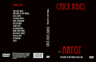
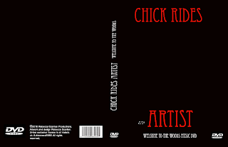
This is the outer cover for my DVD digital package : and beneath is the inlay to my digital package.
DVD inlay
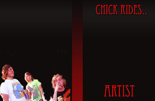
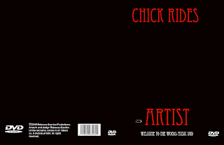
For my media a2 course work, I have had to design a promotional package, involved in this is a DVD digital design and also an advertisement for the DVD that I have created. Above is a step by step progress of my design on photoshop of my DVD cover.I have also created an inlay to go on the inside of my digi pack that matches the outside, as it is the same in colouring and font type matches the outside of the digital package. I have also uploaded a photo of the band onto the inside of the dvd inlay, this shows some members of the band.
In order to get this final piece, i had to consider many things including, genre, audience, house style and theme. Firstly I considered the genre and house style; what would bands like Chick Rides would include in there advertisments and designs? To do this, I had to research bands in order to receive a good idea of what is a suitable advertisement process for a band like Chick Rides, so i looked at similar artists.
Paramore
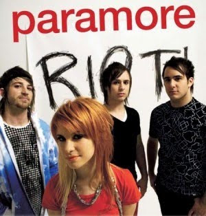
Fall Out Boy
You me at Six
Bullet for My Valentine
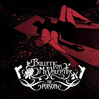
other examples include 30 seconds to mars and green day.
My first idea was to take a band photo and use that as my front cover, with certain edits on the cover for example Fall Out boys cover when you have the band but with logos on there heads, or like Paramores' in which connotes the lead singer Hayley Williams being the only one in color, I chose these ideas as these bands are successfull and the designs obviously appear to the bands audience. This initial idea fell through, because although I did have some decent photographs of the band members, I didn't have the one I wanted and the band had gone away making it hard to get another photo so I went back to the drawing board, and looked at other examples, and then i noticed that actually, most of the genre when noticing front covers of CD's and DVD's, a lot of them were graphic based, so i worked with this taking inspiration from Green Day: Bullet from a Bible and also Rage Against the macheine. Both of these have out lines of the main band members in some sort of stance lifting one arm in the air, rage against the machiene is similar only he is stood as though he is making some kind of political movement.

The DVD cover that I have constructed is similar to this, as central we have the band member blacked out holding up a guitar as if he is on stage, I have also placed a glow around him to present an illusion of him standing in front of an audience, the glow could be from cameras and flashes ect. It also gives establishes that they are a band, with a strong following, who play live. This is exactly the kind of thing that Chick Rides Artist would want to have in order to represent them selves.
When considering how I was going to design the DVD digital pack itself, I also had to consider the genre and who was going to buy it and be attracted to it. Greenday and Rage are both very successful rock bands, therefore taking inspiration from these two bands is liable, as you can see we have the black fill of the lead singer supposedly on the stage, with a glow outlining him and this accentuates the lights and crowd as if he is on a stage and has just finished performing, this is recognisable as live performance is one of the main thing that justifies a rock band. I also took inspiration from music magazines and other DVD/CD digital packs with the colouring, for example Paramore use Red and Black to present themselves, and Fall Out Boy for their latest CD cover have used Black and white. I have also deconstructed a Guns and Roses performance DVD and I like them, have used similar colours, and I have also set out the back of it in a similar way placing the tracks in a long list down the central back of the cover.
I have followed all the criteria that is needed to enable my design to be used, for example, relevant DVD logos, the copyright issue and a barcode in which should be available to see on traditional DVD covers.
When creating my promotional package I also had to include a design for a magazine advertisment.
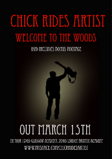
Above is the constructed design for the magazine advert. I again had to consider the same generic conventions and themes when creating it as it is the material in which will initially sell the DVD digital pack itself. Before i created the advertisement I again had to do some research, such as what type of magazine will my advert appear in? How is it going to look? And how will i make it appeal to the reader?
The band that i am researching falls into a metal/screamo/rock category and the most likely magazine that you would find it appearing is KERRANG magazine, a magazine with all the latest news, information, interviews and adverts for famous and upcoming rock bands. In choosing a suitable magazine, i flicked through the pages and analysed adverts wthin in it that are similar to Chick Rides. The main advert that grabbed my eye was Bullet for my Valentines advert for there upcoming single, the whole structure of the advert was similar to my DVD front cover, for example it used the same three colour dynamics: Red, black and white. I there fore thought that this idea wasperfect because it fits in perfectly within the style I am already using for the band, but it is also used by other succesful artists.
As you can see I have included the title of the band in a large font, and also the motif is placed central of the advertisement making it obvious who the band is. I have all the important imformation placed at the bottom of the page, including how to locate them on myspace as myspace is an extremely viable form of web 2 in which rock bands generate alot of their publicity through.
Overall the DVD digital pack and magazine advert are linked by what is shown on them, for example my DVD and advert are linked by font, font size and colour; such as red for large writing, black for the background and white for the smaller font. Both the DVD and magazine have the same logo (man with a guitar on stage) on them and this is done in order to establish the band and logo, and so that people will associate themselves with it. These two products are linked with my music video through mise en scene such as the red black and red theme that follows through the video, and also the logo links with the genre as they are in fact a band and this fact is epitomised on the front of the DVD and advert. This creates a constant representation of the band because in all my products it is made apparent that this is a rock band that is being advertised, through use of musical instruments (DVD and magazine) and through the mise en scene such as the colouring as it is similar because the writing throughout is in red, just like the other products and also the angry format of the video itself.


DVD inlay

For my media a2 course work, I have had to design a promotional package, involved in this is a DVD digital design and also an advertisement for the DVD that I have created. Above is a step by step progress of my design on photoshop of my DVD cover.I have also created an inlay to go on the inside of my digi pack that matches the outside, as it is the same in colouring and font type matches the outside of the digital package. I have also uploaded a photo of the band onto the inside of the dvd inlay, this shows some members of the band.
In order to get this final piece, i had to consider many things including, genre, audience, house style and theme. Firstly I considered the genre and house style; what would bands like Chick Rides would include in there advertisments and designs? To do this, I had to research bands in order to receive a good idea of what is a suitable advertisement process for a band like Chick Rides, so i looked at similar artists.
Paramore

Fall Out Boy
You me at Six
Bullet for My Valentine

other examples include 30 seconds to mars and green day.
My first idea was to take a band photo and use that as my front cover, with certain edits on the cover for example Fall Out boys cover when you have the band but with logos on there heads, or like Paramores' in which connotes the lead singer Hayley Williams being the only one in color, I chose these ideas as these bands are successfull and the designs obviously appear to the bands audience. This initial idea fell through, because although I did have some decent photographs of the band members, I didn't have the one I wanted and the band had gone away making it hard to get another photo so I went back to the drawing board, and looked at other examples, and then i noticed that actually, most of the genre when noticing front covers of CD's and DVD's, a lot of them were graphic based, so i worked with this taking inspiration from Green Day: Bullet from a Bible and also Rage Against the macheine. Both of these have out lines of the main band members in some sort of stance lifting one arm in the air, rage against the machiene is similar only he is stood as though he is making some kind of political movement.

The DVD cover that I have constructed is similar to this, as central we have the band member blacked out holding up a guitar as if he is on stage, I have also placed a glow around him to present an illusion of him standing in front of an audience, the glow could be from cameras and flashes ect. It also gives establishes that they are a band, with a strong following, who play live. This is exactly the kind of thing that Chick Rides Artist would want to have in order to represent them selves.
When considering how I was going to design the DVD digital pack itself, I also had to consider the genre and who was going to buy it and be attracted to it. Greenday and Rage are both very successful rock bands, therefore taking inspiration from these two bands is liable, as you can see we have the black fill of the lead singer supposedly on the stage, with a glow outlining him and this accentuates the lights and crowd as if he is on a stage and has just finished performing, this is recognisable as live performance is one of the main thing that justifies a rock band. I also took inspiration from music magazines and other DVD/CD digital packs with the colouring, for example Paramore use Red and Black to present themselves, and Fall Out Boy for their latest CD cover have used Black and white. I have also deconstructed a Guns and Roses performance DVD and I like them, have used similar colours, and I have also set out the back of it in a similar way placing the tracks in a long list down the central back of the cover.
I have followed all the criteria that is needed to enable my design to be used, for example, relevant DVD logos, the copyright issue and a barcode in which should be available to see on traditional DVD covers.
When creating my promotional package I also had to include a design for a magazine advertisment.

Above is the constructed design for the magazine advert. I again had to consider the same generic conventions and themes when creating it as it is the material in which will initially sell the DVD digital pack itself. Before i created the advertisement I again had to do some research, such as what type of magazine will my advert appear in? How is it going to look? And how will i make it appeal to the reader?
The band that i am researching falls into a metal/screamo/rock category and the most likely magazine that you would find it appearing is KERRANG magazine, a magazine with all the latest news, information, interviews and adverts for famous and upcoming rock bands. In choosing a suitable magazine, i flicked through the pages and analysed adverts wthin in it that are similar to Chick Rides. The main advert that grabbed my eye was Bullet for my Valentines advert for there upcoming single, the whole structure of the advert was similar to my DVD front cover, for example it used the same three colour dynamics: Red, black and white. I there fore thought that this idea wasperfect because it fits in perfectly within the style I am already using for the band, but it is also used by other succesful artists.
As you can see I have included the title of the band in a large font, and also the motif is placed central of the advertisement making it obvious who the band is. I have all the important imformation placed at the bottom of the page, including how to locate them on myspace as myspace is an extremely viable form of web 2 in which rock bands generate alot of their publicity through.
Overall the DVD digital pack and magazine advert are linked by what is shown on them, for example my DVD and advert are linked by font, font size and colour; such as red for large writing, black for the background and white for the smaller font. Both the DVD and magazine have the same logo (man with a guitar on stage) on them and this is done in order to establish the band and logo, and so that people will associate themselves with it. These two products are linked with my music video through mise en scene such as the red black and red theme that follows through the video, and also the logo links with the genre as they are in fact a band and this fact is epitomised on the front of the DVD and advert. This creates a constant representation of the band because in all my products it is made apparent that this is a rock band that is being advertised, through use of musical instruments (DVD and magazine) and through the mise en scene such as the colouring as it is similar because the writing throughout is in red, just like the other products and also the angry format of the video itself.
In what ways does your music video use develop or challenge forms and conventions of real media products?
For my year 13 media coursework, my aim was to create a music promotional package; a set of advertisements that support a band. One of the main factors needed in this promotional package, is a music video, as this represents and advertises the band largely by emphasing genre and who the band are. It is a large part of the promotional package as this is how people will see the band when searching for them on youtube, myspace and music channels.
For our promotional music video we firstly had to consider relevant possibilities, as we had to choose and find a local unsigned band to advertise and create a music video for. Fortunately me and my partner attend alot of a local bars promotional gigs, and were fans and good friends with one of the bands who played here on a regular basis. The bar we attend is a rock/indie bar and the band Chick Rides Artist heavily represent the rock genre with their metal/screamo oreintations, bands similar to them include 30 Seconds to Mars and You Me At six. Our first initial ideas were to film the band in action or just having the band present within the video itself. We felt this was a good idea, because if you look at other videos that fall within the rock genre, as unlike pop, the bands are usually feature playing with in the duration. This amplifies the live status of Chick Rides Artist. We were thinking of a local bar called Rude in order to do this, what made this plan fall thorugh was the fact that the band had some gigs to play up in reading and 2 of the band members were studying away at university, which made it extremely difficult to find time to film within the space of time we had. The alternative to this was to make a disjunctive video that doesnt include the band, this also fits the metal/screamo genre as it is not uncommon for rock bands to follow this disjunctive technique in there videos, an example of something similar as to what we wanted to achieve was Slipknots vermillion.
After looking at Slipknots vermillion this lead us to generate similar ideas in creation of our own music video. Therefore having our first ideas of a girls confused by reality. So basically creating a rock video involving a girl walking around unaware of what to do and what is going on in her life. The goings on around her are suggestive of her state of mind, such as the different lightening and references to past and present, images of violence and blood such as the bloody knives and also the construct of writing which appear throughout to explain the young girls feelings. This idea fits into genre in many ways, with examples of other bands in the same music category using this disjunctive narrative, and also with the video being synchronus with the feeling that the song is portraying as it is angry music in itself.
When looking and constructing our music video, we applied certain media concepts for example when analysing our finished video we have examples of Vladimir Propps character theory (1969). This theory relates to our video as it features the female who is the villain who through looking like intedning to kill her ex lover, she is breaking up with him, providing the implications of the knife, and the metaphorical writing such as kill, which are all symbolic of the things that she thinks he will feel when she leaves him. However to a certain extent our video also converts the sterotype to a certain extent when it comes to traditonal gender roles as the female is the villain in this scenario.
Our music video also follows Toderovs theory of narrative to a certain extent. Toderov suggests that there are 5 theorys a narrative can progress through in order for the human mind to process what is going on, for example everything has to have a beginning middle and an ending, it also must contain states of equilibrium or states of disequilibrium, or in most cases both. Our music video throughout has a constant disequilibrium as there is no solution at the end.
The Mise en scene throughout connotes a girl firstly in her room, the camera follows her movement through out. The mise en scene is in black and white to present ideas, of loss and lack of brightness within her life. The mise en scene through out connotes a girl full of pain and in order to present this angry vibe and fast pace that goes in sync with the song we have placed red flashes, and lots of short eye grabbing shots in which fit in with the disjunctive narrative throughout the video, this added pace to the narrative. Our media video uses alot of conventions of the gothic, which can be related to the screamo/metal genre of music as that is scene as a gothic form of art, it fits into the genre as it combines an influence from vermillion by slipknot,
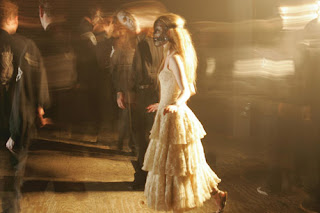
The whole video is tracking a girl, and it doesnt present any of the band members throughout the video. Which is extremely similar to our music video:
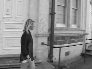
It is also similar to Evanescene 'Bring Me to Life' in the fact that the whole video is dark, and oyscological with in the main members twisted mind, for example when she is walking along the edge of the building looking as if she wants to end her life. She is unsure. The song is of the same genre as Chick Rides Artist and therefore having a similar video to this is proof that it fits generic conventions.
The video does also challenge conventions in some ways, as many music videos presented for metal/screamo bands often feature the band itself. Our music video takes a different route, although alot of other bands have indulged in a disjunctive representation of the band and song within their videos, alot also prefer to be featured in the making, and are often presented with the whole band at stages throughout traditionally 'rocking out.' Obviously we were unable to do this because of certain factors, such as not being able to get hold of the bad at various points in order to do so. To add to the disjunctive theme of the video we have used certain Semic Codes (Barkes) .....
Wednesday, 10 February 2010
Friday, 29 January 2010
Distribution and feedback.
Samuel Fukcing Squire Just found this on the Tube... AWESOME!!
www.youtube.com
An A2 music video following the genre of rock/screamo by Year 13 Students at St Cuthbert Mayne School
Samuel Fukcing Squire
I just realised its Miss.Scanlon...
28 minutes ago
Becca Scanlon
hahaha yes!
10 minutes ago ·
Tom Goodtobearound Gordon
mark says it's amazing
2 minutes ago
As I have already explained, we have posted our music video onto youtube, this is a major and successful form of media distribution and we have posted it up in order to receive feedback and to see how popular the video is. At the moment our video has been present on youtube for two weeks and we have received 108 viewings meaning that youtube is a useful form of advertisement and distribution for this type of genre in music because it has presented evidence of success and feedback.
Subscribe to:
Comments (Atom)
